Virtual Art Gallery - Commissions
Welcome to Roy P Awbery’s virtual exhibition of commissioned artworks in acrylic and water colour. Take a look around and see if there’s something you like. I’m always open to commissions and love to receive a challenge.
Well, here it is! No music. No short piece to video by yours truly. And no linear, slide show experience. Instead, I bring you my first virtual gallery experience without ever having to leave your home.
The concept is simple, enter the gallery and just move your mouse (or finger) over a painting to see a full image and details and then return to the room from which you came. You can also move into adjacent rooms.
I plan to create more virtual exhibitions to show off particular genres of artwork, highlight my free paintings that I give away when I travel (if those days ever come back!) and so on. If you want to see a particular exhibition just let me know. Let me know what you think by leaving a comment below.
NOTE: You will need to open the file in full PowerPoint Slide Show mode to get the full effect. The mouse-over effects and navigation will not work on mobile devices.

Understanding Abstract Art - Why you should buy abstract paintings (Copy)
Don't get abstract art? Think it's just chaotic mess? Me too! Well, I did, but not now. There's far more too abstract than you might think and it's great for decorating your home.
It's just a mess! Anyone could do that! They've just thrown paint around! What's it supposed to be anyway? Sound familiar? For years I didn't like or understand abstract art. Then I became an artist and now I think I get it. There's more to it than you might think.

Understanding abstract art just requires an open mind
If I'm brutally honest, I really didn't like abstract art. Many of those comments were probably things I'd said in the past. But then, I didn't always like classical music either. It may seem odd but the two are related. It's all about having an open mind and opening oneself up to something new.
My first experience of abstract art was an exhibition at the Tate Modern in London. My wife dragged me there, almost kicking and screaming! To me it seemed to just be pretentious nonsense. Random splodges of paint; chaotic; structureless (I like structure!) and seemingly pointless. Of course now I would argue that I was completely wrong and was simply approaching it with a closed mind and no wider thought or imagination. Put another way, I was trying to understand something in a very binary way when it wasn't possible. The abstract artist isn't trying to paint a single image or meaning. Abstract art requires a little effort from the viewer.
Feeling it
Take classical music. I spend more time listening to Classic FM than I do watching TV. I don't know the notes or understand how the composition was put together. I don't even hear all of the different instruments in a symphony. And I don't need to. I simply listen and allow the music to transport me. Each piece may invoke a different feeling or mood but this isn't something that was intended by the composer, it comes from within and is deeply personal.
Filling in the blanks
The same is true of abstract art. An artist isn't necessarily trying to show you a specific image. You, as the viewer, have the job of providing that meaning and deciding what feelings a piece invokes. It just requires an open mind and a little imagination. Do this and suddenly a whole new world opens up in front of you. Yes, I know, it all sounds very poetic and ideal. But, from someone who really didn't get abstract art I can safely say it's true. I don't just paint abstract art, I also enjoy it and spend a lot of time looking at, and enjoying, other artists’ work. I enjoy the process of trying to work out what I can see and looking for patterns and meaning that are personal to me. Quite literally, my job as the viewer is to fill in the blanks. The artist's job is to provide something for me to ponder on.
But is it art?
Okay, maybe you don't quite buy the poetry of it all and are not so convinced about moods or feeling. So why would you hang abstract art in your home? A recent client of mine explained this simply: abstract art can be used to decorate a room easily. Seriously?
If you think about it this makes perfect sense. If you're looking for something to decorate a wall in your living room and your decor calls for something red, blue or whatever colour you have in mind, abstract art can provide it. Moreover, abstract art tends to be more thought out than you might think. Often, complimentary colours are used to create a balanced image and these can be used to blend in with the decor in a room. A very plain wall in a minimalistic room could be transformed with a single, large and vibrant abstract painting. Equally, a busy room can be toned down with a simpler abstract painting.
Food for thought
Finally, abstract art can, and often does, provide a talking point. Not everyone will like it. Not everyone will get it. Not everyone will see what you see. And that's absolutely fine! So talk about it. Discuss and debate about it. Hang an abstract painting in your dining room and you can be certain that someone will want to talk about it. If nothing else, you'll have something to talk about if the conversation at your next dinner party ever runs dry!

Why gallery representation isn't for me - yet.
Many up and coming artists seem to think a key goal is to get their artwork into a gallery. I don't! There are good reasons for wanting to get into a gallery but there are also good reasons not to. Here I explain why it's not for me, despite being offered the opportunity and why it's good for you that I don't.
Many up and coming artists seem to think a key goal is to get their artwork into a gallery. I don't! There are good reasons for wanting to get into a gallery but there are also good reasons not to. Here I explain why it's not for me, despite being offered the opportunity and why it's good for you that I don't.

Gallery exhibition? Maybe one day.
Having made a success of advertising and promoting my artwork over the last year you'd think it would be a good time to get into a gallery. Surely it's time to get my paintings sold from a smart and sophisticated gallery setting. And what about all those potential new customers? Well, not so fast!
I was recently approached by a gallery to ask if I'd be interested in them representing my work. This sounded both exciting and flattering. I'd finally become a real grown up artist! But then I did some research…
First of all galleries, at least good ones, don't typically approach artists. It is more usual for an artist to approach a gallery and have to sell themselves. So that was the first red flag.
High sales commissions equals higher prices
Then I discover that they take 51% of the sales! This would have the knock on effect of pushing my prices up by at least double just so I could make the same money. This would also increase all of my prices thus making a lot of my paintings unaffordable to those who have previously bought from me.
Restrictions imposed - no personal sales
Another issue I had was that the gallery insisted that only they could sell my works. I wouldn't be permitted to sell from my own website or other outlets. I would be allowed to show and advertise my work though.
Free giveaways banned
Another restriction was that I wouldn't be allowed to give any paintings away for free or leave any in cities to be found by lucky recipients. I get a great deal of enjoyment out of doing this and found this restriction a step too far.
But there are positives to galleries
Okay, galleries can't be all bad, and they're not. My experience is based on one instance and probably not very representative of the wider industry. Galleries can put your work in front of a wider, interested audience. The presentation and setting for your work is more professional. A gallery may be able to advise on trends and help you develop your works to march potential customer needs.
But getting into a gallery doesn't mean relaxing
Of course, it might seem simple. Put your work into a gallery and let them do all the hard work for you. After all, you're paying half of your sales to them do you don't need to do anything, right? Wrong! You still have to self-promote and still have to engage with potential customers whilst still doing what you should be doing - painting. I'm only touching on this subject very lightly but gallery representation doesn't mean zero effort on your part.
So would I ever use a gallery?
I wouldn't be so quick to dismiss galleries. At the current time they're not for me. Equally, I may not be for them right now. They do have their place though and reputable galleries may well be able to open up opportunities that I couldn't reach without help. However, for now, I'll keep to personally advertising and promoting my work. It's working.

Why I don't mix my paints
Can you mix student and professional grade acrylic paints? Many websites and indeed artists will say yes. I would argue that you shouldn’t if you want high qualityand consistent results. Here I explain why I don’t mix my paints.
Acrylic paints come in a variety of grades and can be summarised as student grade and professional. Can you mix the two? Why would you want to? When should you use one over the other? What happens if you do mix the different grades? Will the world explode? Will the artworld disown you? So many questions! I’ve used acrylic paints every single day for over a year now and here’s what I’ve learned.

Paint Quality
Acrylic paints generally come in two grades: student grade and professional (also known as artist grade). Professional paints tend to come in a wider range of colours than student grade and have deeper colours due to the increased amount of pigment compared to binder. Students' colors are cheaper but you will find there tends to be a smaller selection of colours and specialist colours may not be available at all. I’ve also found that, due to the increased amount of filler, the colours tend to be weaker. I have found that professional grade paints are more vibrant and lively and are often more consistent in their viscosity (how thick or thin they are) and this makes them easier to blend.
The ability to blend paints is key for me. I paint a large amount of abstract and landscape paintings where fine blending is required. I have found from experience that mixing the two grades of paint and cause the paint to suddently stick or drag which makes blending extremely difficult. Of course, you can blend in both grades but I find it harder if the two grades are mixed so I don’t do it.
There is of course a place for student grade paints. I use them for prototyping my larger paintings and commissions rather than using expensive paints. They are also perfect if you are just starting out but if you are intending to sell your work then I would recommend moving on to professional grade paint, particularly because you will want your colours to have longevity.
Colour Longevity
If you intending to sell your artwork then you will undoubtedly want your work to last a long time. Paints, like anything that is coloured, will be affected over time from exposure to variations in temperature, humidity and light. Fairly obviously you should recommend that your paintings are not kept in direct sunlight - UV radiation will very quickly dull your colours and lead to fading. But there is something you can do to help - use paints with high pigment to binder ratios, which means using professional grade paints.
A subtle point I learned was what is meant by the word “hue”. Without getting into the detail, hue simply means that a colour is intended to closely mimic a natural pigment of that colour but it isn’t actually the genuine pure pigment. This too can have an effect on how long your colours remain as you painted them. So put simply, use the best quality paints you can if you want your work to last.
So, if you ever wondered why many paintings are quite expensive it is likely to be partly due to the cost of the materials used as well as the skill of the artist. The benefit to you of course is that you can be sure that your painting will last a very long time and maybe even increase in value over time.

Primed and Ready. Why prime a Pre-primed Canvas?
Jackson Pollock didn't always prime his canvasses and sometimes even used household emulsion when he did. So why prime canvasses before painting? Like anything in life, quality is built on good foundations.
Jackson Pollock didn't always prime his canvasses and sometimes even used household emulsion when he did. So why do I prime my canvasses at least three times before painting? Simple, because I want a good surface to work on and I want my paintings to last. Like anything in life, quality is built on good foundations.
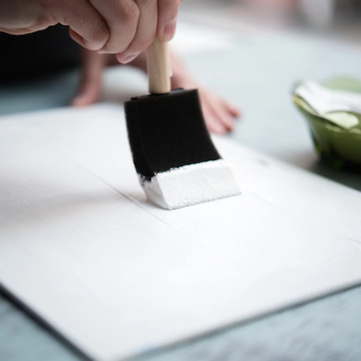
A well primed canvas is the foundation to any good painting
Almost all commercial canvasses arrive pre-primed and some even claim to be triple-primed and ready for use. However, I've found that all need some preparation before use. Priming the surface means making it ready to take on the acrylic or oil-based paints one intends to use and to also improve the painting's life span. Apparently, some Jackson Pollock paintings were not primed, or were even primed using household emulsion (yes, really!) and are already showing premature ageing.
Why can't I use pre-primed canvas?
So what's wrong with pre-primed canvas, I hear you ask? Put simply, it is not in the economic interests of commercial suppliers to prime canvasses with thick layers of high quality gesso (the primer). They are more likely to apply thin coats of weak primer simply to provide a modest layer over the canvas. This results in a surface, fresh out of the box, that can be inconsistent (rough and smooth in different places) and a lot more porous do you will use more paint. The surface may also be relatively rough (toothy) which may be fine if that's what you want (some artists like and use this effect) but I find a smoother surface much easier to work on and I use less paint.
How I prime my canvasses
I'm sure every artist has their own ways of preparing their canvasses and this is mine. It takes some effort but it is worth it, in my opinion. In summary, here's what I do:
Dust off the unpacked canvas with a lint free cloth.
Lightly sand the surface with a very fine grade dry sand paper.
Dust off the surface again with a lint free cloth.
Apply a generous layer of good quality primer with a wide flat brush, brushing in both horizontal and vertical directions.
Allow to dry completely.
Sand the surface again with very fine grade dry paper and dust off.
Repeat the application of gesso primer followed by sanding and dusting.
For the final coat, apply the gesso primer with the flat brush but the smooth the surface, before it drys, as follows.
Using a wetted mop-head brush with very fine hairs brush straight across the canvass in horizontal strokes in a single movement from left to right. Work down to the bottom of the canvas. This smooths out any lines caused by the flat brush.
Allow to dry completely.
The canvas should now be ready for use.
This method works for me and I have found that my paints are much easier to apply and work on the canvas. I prefer not too have too much tooth showing in my paintings so this method also serves to reduce this effect. Beyond this, a solid foundation should ensure that my paintings last for as long as possible.
But if it was good enough for Jackson Pollock….
Now, you may wonder why it's not advisable to use household emulsion. After all, it's cheap, has a consistency similar to gesso primer and it was good enough for Jackson Pollock. Well, quite simply, it isn't good enough. Some of Jackson Pollock's works have already started to suffer from premature ageing. Most notably, cracking. One only has to consider how emulsion behaves in the home. Over time, and with exposure to varying temperatures and humidity, it will crack. It's just not designed to cope with movement and one can imagine how much movement a cotton or linen canvas would experience. So, don't skimp on primer. Use high quality gesso and leave the emulsion for your house!

Getting engaged! How to master Instagram
Positive engagement is key to success with Instagram and I’ve now learned that it’s good to talk. Good engagement can increase followers and your overall engagement rate leading to more sales.
Instagram is clearly the most influential social media platform for promoting one’s artwork and I can honestly say that I get more engagement, which turn into sales, from Instagram than any other platform. But my following and level of engagement has plateaued in recent months so it was time to come up with a strategy. My previous post discussed the importance of imagery and this one will explore positive engagement. It turns out that it’s good to talk!
It really is all about engagement. There are many accounts out there with apparently thousands (even hundreds of thousands) of followers but all may not be as it seems. It turns out that you can buy followers or even pay to get an inflated number! Of course, this means they are not real followers and therefore not real potential customers. One way to spot this is to look at the level of engagement in someone's post. Someone with over 10k followers but only getting around 100 likes and a couple of comments is clearly not looking too genuine or has a very large but disengaged (disinterested?) audience.
I have therefore learned that success on Instagram is not measured by the number of followers but more by the level of engagement. I now make a point of not only liking an image I genuinely like but also commenting back and sometimes starting a dialogue with someone. It could be about their current work, their inspiration and motivation. Anything, as long as it's meaningful. And it's working. I may only have just under 700 followers but all were organically grown and I get around 15-20% engagement if I count direct messaging. Some of my sales have come directly from Instagram too!
So, put simply, it’s good to talk! I’ve been using this strategy for about a week now and, combined with the photos of me smiling a lot, my engagement rate and number of followers has significantly increased. I’m less concerned with the number of followers as that doesn’t necessarily mean more sales. I think the number of followers is mostly a vanity measure. The engagement level, however, does tend to give an indication of success. If people are contacting me and discussing my paintings it is far more likely that they may want to buy something or, if they are an artist themselves, they may wish to collaborate on a joint article, for example.
It really is good to talk!
Say Cheese! Why I'm appearing with my paintings
Why posting pictures with my artwork is necessary and paying dividends. More cheesy smiles to come!
When I started painting I thought I could get away with just posting the odd picture on Facebook to show my friends what I'd done. As things have developed and I now sell regularly there is a need to publish images across several platforms. What I didn't realise is that cheesy smiles sell. I'm so glad I look after my teeth!

Say Cheese! Showing one of my pieces in The Elements series
Since my art sales picked up I realised I would need to promote my works to a wider audience and thereby increase my chances of sustaining this success. The most obvious way was to engage with social media. So, with some expert help from my kids I set up an Instagram business account amongst others. Until now, I had no idea what I was doing and assumed if I followed a few people they would do the same and in no time I would have tens of thousands of followers and potential customers. I was wrong! It seems there is a bit more to it than that.
I was already ticking one box and that was to ensure that I posted images regularly and at the right times of the day when people are more likely to see my posts in their feeds. Instagram exposure is transient and you don’t get to stay on peoples phone screens for very long. The other thing was to ensure that the images I posted were good quality and represented what I did. Not just painting though, apparently it is a good idea to show that you’re a human being so posting photos of my other activities was also another tick in the box. But, all this was fine but my level of engagement and followers had flatlined, neither going up or down. Something had to change. Well, as it turns out several things but I’ll address just one in this blog.
I discovered, by looking at other artist's profiles, that one needs to show some personality and pictures of oneself with the artwork. I needed to clean my teeth and say cheese - a lot! When I looked at some of the most prominent and successful artists promoting their work on Instagram the same thing showed up - they were all showing themselves with their artwork or in their studio or in the midst of working on their latest project. If you don’t believe me take a look at Swarez, Sophie Tea and Lina Vonti, as good examples. These three combine high quality imagery, engaging and interesting photos and include something of themselves that provide an insight into their personalities. I’ve only been an artist for a year and a selling artist for much less, and although I’m enjoying regular sales I’m still almost unknown. So, following good practice can only help, which is why I follow these amongst others.
I've only just begun to do this in the last few days and it has already had a marked effect. In just 7 days my following has increased by another 15%. Not too bad at all!
Of course, this all means you will now be seeing a lot more of me and my cheesy smiles! I guess eating spinach is off for a while!

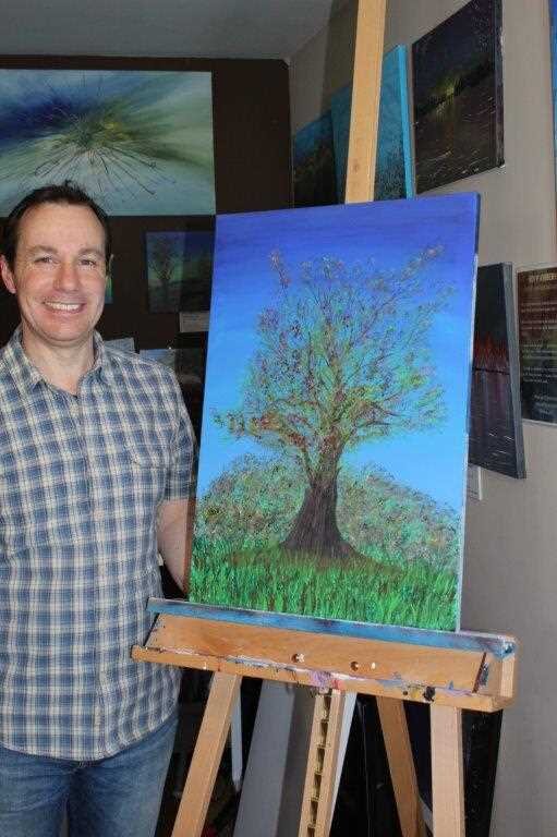
Introducing The Artist Formerly Known As Doctor!
The Artist Formerly Known As Doctor! Why I identify as an artist rather than a scientist. And why I'm not called TAFKAD!
I wasn't always an artist. I actually only started about a year ago. My background is science, and nuclear-related at that. With a PhD in chemistry I have the pre-nominal title of doctor but I don't use it in my art world. Here's why.

Artist or scientist? I think it's obvious!
I started my career that led me to become a research scientist in the nuclear industry a long time ago. 32 years ago, in fact! Crikey, am I really that old? During all that time I'd never painted and, to be honest, art wasn't really my thing. And abstract art definitely not. In fact, I recall years ago when my wife dragged me to the Tate Modern in London and I was stunned at what was being passed off as art: a stack of different coloured towels (we had that same artwork in our airing cupboard at home!) and a broken fence panel painted in garish blocks of colour! I'm not joking. This trip did not inspire me to fall in love with art.
This all changed when my wife bought me a set of water colours for Christmas in 2018. As I didn't paint I thought this was a rather odd gift. However, my wife is always looking for new hobby ideas to keep me occupied (or out of trouble!). A year later I start to play with the paint set and painted every day for a month until I'd cracked it. Those 30 days are detailed in my About pages if you want to know more.
As my artwork has taken off so too has my appreciation of just how much thought and work goes into a piece. Yes, even abstract! I now paint many abstract paintings and I can truly say that I get it. My own pieces all have a deeper meaning or intent behind them. They are not, as I once thought, just random splodges of paint on a canvas. There is a lot of thought required to be able to produce something that is balanced and thought-provoking.
Since July 2019 I have been amazingly lucky to have been selling my paintings on a regular basis and can even boast a small community of collectors. I could not have imagined that a year ago. And I love it! I am constantly stunned that I'm able to create artwork that others want, and want enough that they will pay good money for and display in their own homes. When I produce a commission, the look on the face of a happy client is also huge bonus for me and I want to keep repeating it.
So, despite over 30 years in the nuclear industry and holding three degrees and the title doctor I'm more happy to identify as an artist. In fact, when people ask what I do these days, I tell them I'm an artist. I don't mention my day job at all. Would being titled doctor help me sell more art? I doubt it. I think people buy art because they like what they see not because of someone's title. So, I don't tend to use mine. In a nod to the pop legend that was Prince I'm now The Artist Formerly Known As Doctor! TAFKAD! Oh dear, perhaps not!

Getting ahead - preparing for my biggest commission yet
Preparing for my first 4-figure commission. Only a lot scary! Here's what I have to worry about.
A couple of days ago I received a request for my biggest commission so far and my first 4-figure sum. This was not to be taken lightly and I need to build up to it. It's going to be big!

Getting prepared to practice for the commission
Here you can see that I have one background-prepped canvas on the easel and another two triple-primed on the floor. They might become pieces to sell but that's not their purpose just yet. The commission is going to be big, up to 7 feet long, and painting anything on this scale is going to need some new skills. Maybe s bigger studio too?
First off, the paint needs to stay mobile for longer and not dry out before I've had time to blend it. As paint dries it tends to seize up and stall as one tried to apply it across the canvas. Some magic retarder liquid will be in order.
Then we have the colours. What works on a small scale may not work the same way when going large. Experimentation and practice is needed. Yes, I get the irony - colour blind artist worrying about the colours!
Brushes! I'm definitely going to need a bigger brush! I guess I could go all Sean Scully and use s fence brush!
Finally, I need an idea! As usual, I have no idea what I'm going to do but for something this size I feel I should at least have some kind of plan. If for no other reason than I need to know what paints to have available.
The one thing I do know is that the commission will be an abstract piece which sounds easy but, as I've learned, there really is an art to it (pardon the pun!). The skill is in creating something that invokes a feeling or a mood and isn't just a mess! We shall see if I can pull this off. Stay tuned!
If you'd like to have a chance if winning an abstract painting just sign up for my bimonthly newsletter.

Certificates of Authenticity (proving it's really an Awbery!)
Why every one of my paintings has a Certificate of Authenticity to prove provenance and proof you really own an original painting by Roy P Awbery
Every day's s school day, or so it seems as I learn about something else I should be doing with my artwork. Certificates of authenticity turn out to be very important. Find out why.

Certificates of Authenticity -really rather important!
Ads my artwork has been selling more and more I've constantly been reflecting and adapting my approach. This has applied to packaging, shipping and the whole customer experience. However, I hadn't realised the importance of providing evidence that my paintings were my works or indeed asserting my rights regarding copyright. This is where a Certificate of Authenticity (COA) comes in and every painting I produce now has one. But why?
A COA proves that my paintings were actually created by me and, in the future, could be important in determining the provenance and relative value of the work should it be sold later on. This is especially important, if I'm lucky enough to become well-known and valued in the art market.
Certificates of Authenticity can actually make artworks easier to sell, especially in auctions or galleries (although I currently choose not to look for gallery representation). Serious art collectors usually require any work they purchase to include a COA in order to prove provenance should they choose to sell the work on or donate it in the future.
So, if you buy any of my paintings from now on you will always receive a Certificate of Authenticity. As my artwork has already been steadily increasing in value as my work sells you may indeed be glad of having something that proves your painting’s provenance and future value.
Besides, the Certificates look nice too!

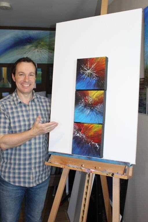
Abstract may be me!
I've discovered that dynamic abstract art may be my niche. Read on to find out why.
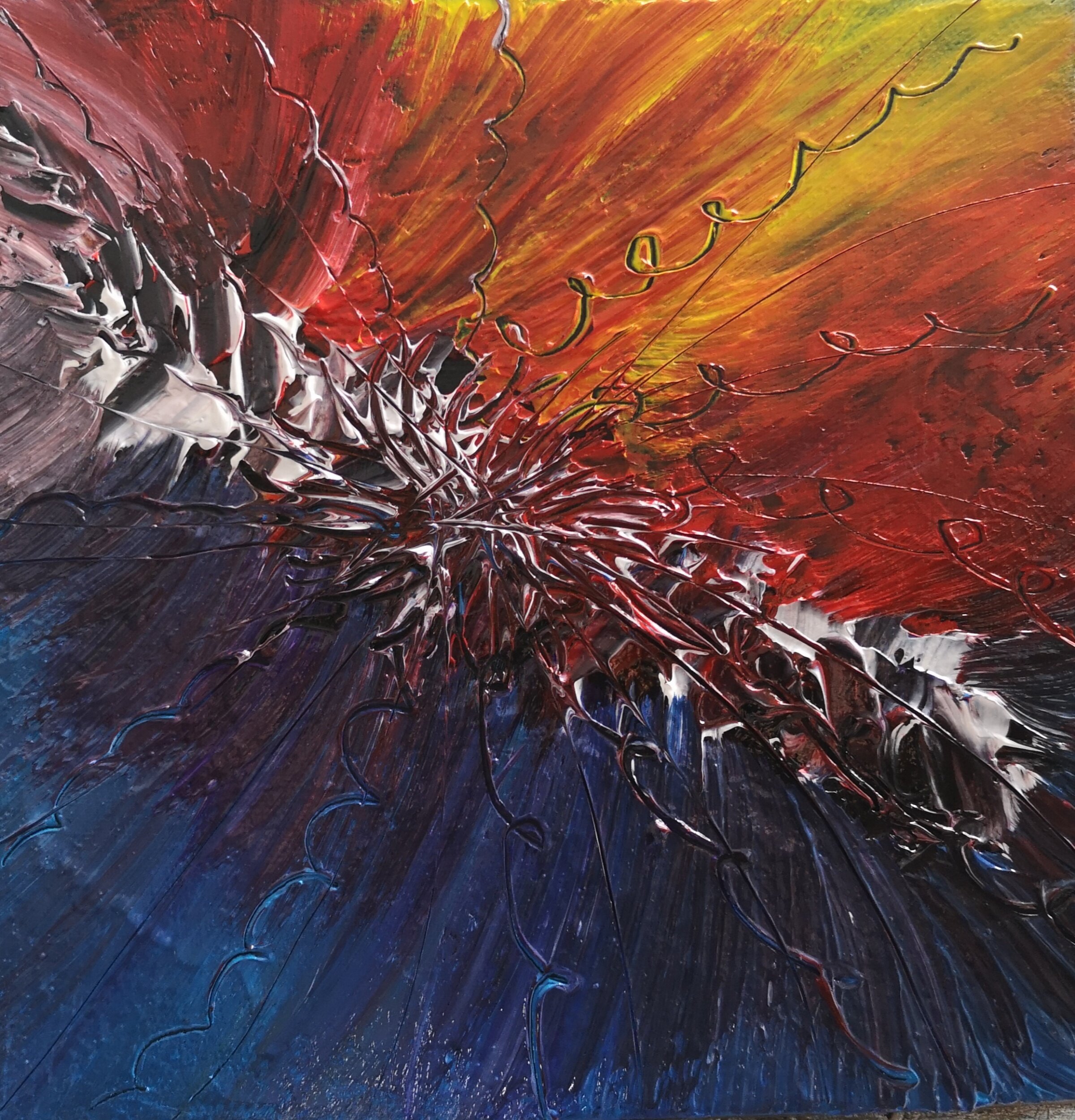
Yesterday I posted three paintings titled The Elements and put them up for sale. In less than 24 hours they were sold! I then started work on a larger abstract piece and this prompted a request for a commission. I think I may have found my niche!

Going large with abstract!
Creating this piece was a lot of fun and just a little messy. There is definitely something to be said for flinging paint around! My wife had something to say too!
This piece isn't quite finished yet. I think I want to add a bit if geometry to it so who knows what it will look like later today!
I found myself completely immersed in the moment when painting abstracts and could happily spend all day making these. And now, I have a much bigger one to work for a client. That should keep me busy for a bit!
Have a great weekend!

The Elements - New Abstract Collection
The Elements are a trio of new abstract paintings by Roy P Awbery, representing Earth, Wind and Fire. Acrylic on box canvas.
I managed to spend an entire day in my studio yesterday and had some abstract fun. The result - three small box canvasses that go together really well. Named by a good friend, the three are titled The Elements with each being Earth, Wind and Fire. Available for sale and will soon be on the website. Contact me if you're interested and get 20% off before they go on the website.

Earth by Roy P Awbery

Fire by Roy P Awbery
Wind by Roy P Awbery

Primed and Ready!
A blank canvas with so much potential and may become a free painting to a subscriber.
A blank canvas! What will I do with it? So much potential and so much time. I'm having a day off from the day job and having a painting day today. Although my desk easel is starting to look like an abstract artwork in its own right!

A blank canvas primed and ready
So, mindful that I haven't finished any new paintings for a while (building the new website took all my spare time) I've decided today is a painting day. This small box canvas may become one of my free giveaways and may become an abstract piece. I'm not sure yet. I would usually leave it in a town or city to be discovered but, with lockdown, I'll be giving it away to one of my subscribers. Want it? Simply subscribe!
I've also primed another two larger canvasses and I have no idea what they will become. My floral series was hugely popular and I now only have two left so perhaps I'll create a few more. But then, I love the energy that I put into creating the abstracts so maybe I'll have a messy painting day and unleash my inner child! Well why should kids be the only ones to get messy? Of course, my wife may have something to say if she catches me throwing paint all over the place. I really need to find myself a large studio space! Now there's a thought - imagine the huge canvasses I could create then! Hmmm!
Have a great day folks and subscribe if you want a chance to win a free painting.

Setting up online payments
Being able to accept online payments is essential but also challenging. Read on to find out why.
It's taken me several weeks of hard slog but I have finally taken the next step with my artistry website and set up the capability to take payments online.

Taking online payments - the next step
Up until now my website was simply a gallery to be used to view my artwork before one would be redirected to a separate online shop in the form of Etsy. This was fine to begin with but it came with issues.
Etsy on its own is actually a great selling platform. Once you have your products added with all the right keywords you would have access to potential buyers with relatively little effort. After all, millions of prople visit Etsy every day. Of course, it helps if you pay for advertising so that your shop can be highlighted and found! So, if you're just selling direct from an online shop it's fine.
The other issue is cost. Etsy is actually quite expensive when it comes to fees. You pay to add to your stock listings, you pay to advertise and promote and you pay fees and VAT on your sales. On occasion the fees can be as high as 10% in my experience.
But, there is one other major disadvantage with using a separate online shop. Redirection! If your buyers cannot buy direct from your website and you redirect them elsewhere you risk losing the sale, for a variety of reasons.
Your buyer may trust you and your site but not the site you redirect them to.
Your buyer is not happy entering their personal details into another site.
Your buyer may feel obliged to register with the online shop when they don't want to resulting in walking away.
Some people don't know or trust Etsy or other online shop.
I received feedback from customers and all of these points were raised at some point. The answer? Take payments online direct from my own website.
I won't lie. It sounded easy but the whole process was a long slog. First, my website had to be upgraded to be able to do commerce and this meant creating individual inventory items complete with lots of details. Then, I had to set up business PayPal and Stripe accounts to enable me to accept payments online. Of course, these accounts then have to be linked to your website which proved to be anything but simple! But, after many hours of plugging away at it I have finally set up my online shop within my own website.
Was it all worth it? It's too soon to know but I'm optimistic as ever.

New lights! How lighting can help with colours
Ambient light can have a dramatic effect on a paintings colours. Here I discuss how my artwork was affected and how I solved the problem.
Those of you who follow my blog or my work will know that my unusual angle is my colour blindness. What you may not be so aware of is how light can also affect the colours one sees, whether or not you're colour blind.
I've been painting a wide range of different subjects including night scenes, snowscapes and even cats. When I was reviewing some of previous artwork I noticed that there were differences in the colours that came out, even in similar paintings. This was actually highlighted when I was interviewed on BBC Radio about my artwork: I showed three floral pieces that all had blue skies. Or so I thought. It turned out that all three were noticeably different, but not to me. So what was going on? It was time to investigate.
It turns out that there is a lot of information available on the subject of colour temperature and how it can affect an artist's work. Rather than simply copy and repeat what's already out there, if you're interested in learning more read Dan Scott's informative blog. In summary, it all means that the colours you see depend entirely on the ambient light around you at the time.
So how did I end up painting three different coloured skies? Quite simply, it was the time of day! I painted all three on the same day. However, the first was painted in the morning when it was still dark outside and my studio was illuminated by a tungsten overhead bulb and two LED lamp lights to the side. Both gave off a warm, orange-like colour. The second was painted around midday and, with the curtains open, the north-facing room was bathed in a cool flat light. By the time I painted the final one it was still light outside but significantly dimmer and so my side lights were back on. So you can see, three paintings on the same day with totally different lighting resulted in different skies. So, what's the solution?
I needed to have a consistent light source with the same colour temperature and, ideally, one that represented daylight but also that might be found if my art was displayed anywhere. The solution was daylight bulbs. However, I did a lot of research and almost bought some relatively cheap LED panels from Amazon. Until, I looked at unpaid reviews and comments; cheap LED panel lights are small, not very powerful and not fit for purpose (in terms of art studio lighting). Instead, I found daylight studio lights from Heamar. (My blog is not sponsored so this is just honest commentary). They arrived within a week of ordering, were quick and easy to assemble and appear to be very good qualiry. And they are powerful with their 32W equivalent bulbs. I bought two at a cost of £176. So, did they work? Read on to find out.

Heamar daylight lamp stand

Grammar daylight bulb
I've recently been working on a painting of a cat and to my dismay found out that some green colouring had made its way into the picture. Not good when the cat is meant to be creamy-ginger colour! Under my less-than-ideal lighting I just couldn't see it. Now, with my new daylight lighting setup even I can see something is wrong. To be honest, I can't see the green but I can now see the areas where the colours are not matching. The image below is of the unfinished painting under the new lighting. Clearly, I have some more work to do!

Green cat? Daylight lighting showing the true colours

Finding inspiration from staying in
Here we are heading towards a third week of so-called lock-down due to this dreadful Corona virus. I'm now working from home 100% of my time and go out for an hour a day to walk the dogs for exercise. Of course, this means all my travelling has stopped and so too has the opportunity to see new things from which to draw inspiration for my paintings. Or so I thought.

Springtime inspiration in the garden
The water colour painting above was the result of sitting in my garden watching the birds compete for territory and empty my bird feeders, well, when they could get past the greedy pigeons! I think I'd taken my garden for granted and not really considered it as a source of ideas for my work. Now, forced to stay at home I started to properly look at what was right in front of me. Not just birds but flowers too.

Amazingly vibrant tulip

Colourful inspiration all over the garden
I've also found that my love of abstract art can be inspired and motivated from my garden. Just looking closer at some of the plants and flowers provide for a very different perspective. Take this image of the anthers inside the tulip - totally abstract when the wider context is removed but still a beautiful image. I think this would make a great large acrylic canvas and would make a fantastic addition to someone's home. Assuming they like red!
I'm sure I will find more inspiration in the coming weeks. If you'd like to see what comes next why not subscribe and follow my blog?

Abstract inspiration deep inside a tulip

First BBC radio and now the company magazine!
It's still hard to believe that I've only been painting for little more than a year and successfully selling paintings for half that time. I've now sold around 30 pieces of my artwork and am still amazed that people actually like my work enough to buy them.
It's been quite a year so far with highlights including being featured for almost an hour on BBC Radio Berkshire, having my art displayed at the Award winning gluten free cafe, Nibsy's, in Reading (twice!) and now…making it into my company's in-house magazine!
It really has been incredible and, as the article states, I am truly humbled by the success I’m enjoying. I keep trying to add more interest to my work so have now begun to record YouTube videos of some of my work. I'm also enjoying being challenged by friends to paint different subjects that take me away from my comfort zone (landscapes). I'm still growing as an artist but I love the fact that I feel that I can legitimately self-identity as one!
Of course, none of this would have happened if people, possibly you, didn't enjoy and purchase my works. Thank you!

Featured in my company’s in-house magazine

Colour blind artist in great company!
How does one stand out in a world full of successful artists? Marketing people will say you need to find your USP or unique selling point. Mine? Being profoundly colour blind.
Can you see the number in the image here? No? Then, like me, you're probably colour blind. Colour blindness can come in a variety of forms including red-green (the most common); blue-yellow and monochromatic. Then there is me! My colour blindness appears to be a mixture of a problem with my eyes but also my brain. Rather bizarrely, I don't seem to be able to recognise most colours except really bold primary ones. Mixed colours completely confuse me and I'm unable to even suggest the name of a colour in many cases. However, I do still see in colour but possibly not quite in the way that you do.
There is no cure for colour blindness despite the ridiculous adverts one sees on the internet. The most awful of these are the correction glasses from Enchroma. They show clips of apparently colour blind people being given the gift of perfect sight with a pair of sunglasses. Thankfully science has stepped in to debunk these nonsense colour vision correction glasses.
So can I really be an artist with such a condition? Well, I'd argue that the proof is clear. Having been a selling artist for little more than a year I've sold 30 pieces. Many were commissions and the client knew I was colour blind. It's become my USP.
Of course, there are plenty of artists out there who are colour blind and some notable greats included. It's believed that as Monet developed cataracts his colour vision failed and even Vincent Van Gogh was thought to be afflicted.
If you're interested in Understanding colour blindness a bit more this link will get you started. Of course you can also ask me.

Can't see the number? You're probably colour blind!
A Winter's tale - another commission finished
Today has reminded me why I love painting and why this hobby of mine has stayed with me when so many others have gone. No, it's not because it earns me money! The smile on the clients face when he saw his painting for himself for the first time. He was rather pleased to say the least.

One happy client with his commissioned artwork by Roy P Awbery

A Winter's Tale by Roy P Awbery - close up
This painting was very challenging but I got a great deal of satisfaction from finally getting this one right. The original plan was just to have a night snow scene but, as the painting developed, the client asked for the addition of wolves and an elk.
I managed to capture a sense of movement with the animals which was not easy. I'd not tried to do it before but it seems to have worked.
I'm seriously pleased how well this one turned out and now understand why my followers were not too happy with the very simple Jumble Animals. Lesson learned!
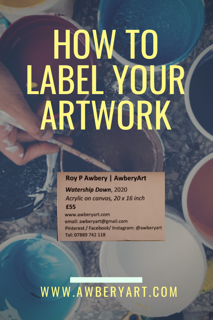
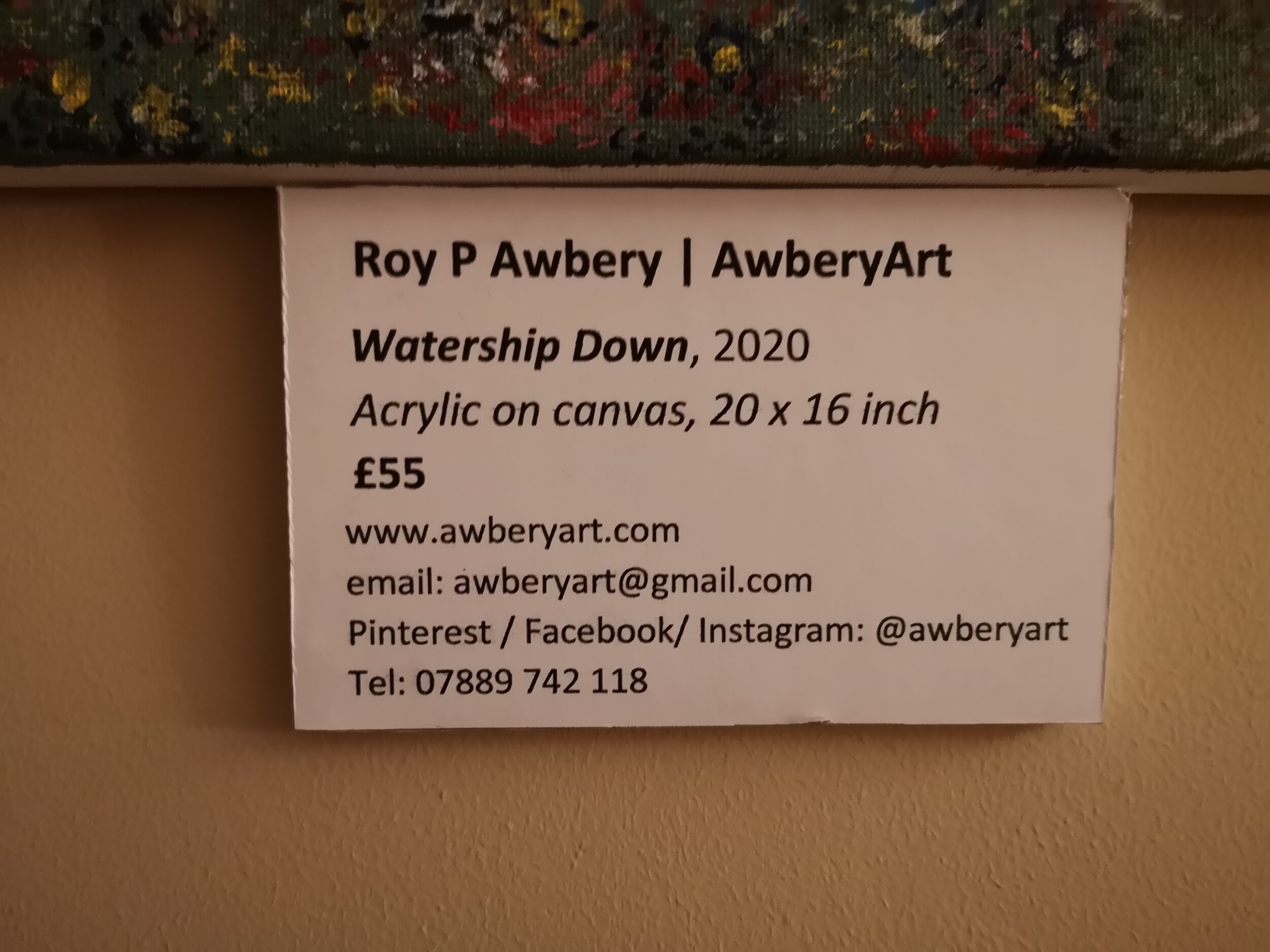
How to label your paintings and artwork
How to produce professional looking labels for paintings and artwork.
So, after some trial and error, mostly error to be fair, I’ve finally realised how to label my paintings both for display and for sale. It’s actually really simple and all it takes is a little crafting.
First, what not to do:
I’ve now sold my art at a craft fair and on reflection realised that stickers with pricing on them is really not ideal and looks unprofessional. I also had my work displayed earlier in the year and forgot to put any instantly visible details of who I was or how to contact me! More recently though, I saw another artist’s display and they used simple card parcel tags which had the price on one side and the name of the artist on the other. Still far from perfect. However, I then recalled what one sees in galleries and museums: clean, bold labels written in black on a white background with easy-to-read font and all the details anyone could need.
So this how I do it:
( Add your name or business name in bold
Add the title of your work and the year (same size font as above but in italics
Media type and size (and don’t write “mixed media” - it tells no-one anything meaningful!)
Write the price in bold
Next I include my contact details in the following order:
website (and I suggest buying a domain - longwinded web addresses just look amateurish)
Contact email address
Social media handle - I used the same, @awberyart, for all of mine and don’t forget to say which platforms you can be found on
Telephone number - especially useful if you are displaying in a public space such as café, library, waiting room etc.
Now set all of this up up in a word document and insert a single line border around it - this makes cutting easier later. Now go and print it out but see below before you do.
But don’t just print it on paper!
You need to print on good quality thick card that will run through your printer safely. I use WH Smith’s A4 Card which works just fine.
Next, you’ll need some white foam board which I pick up from Hobbycraft.
Now simply glue the cut-out printed label onto the foam board and ut out to create a single 3-dimensional plaque to mount next to your artwork.